Tools / Keep Design System
About Keep Design System
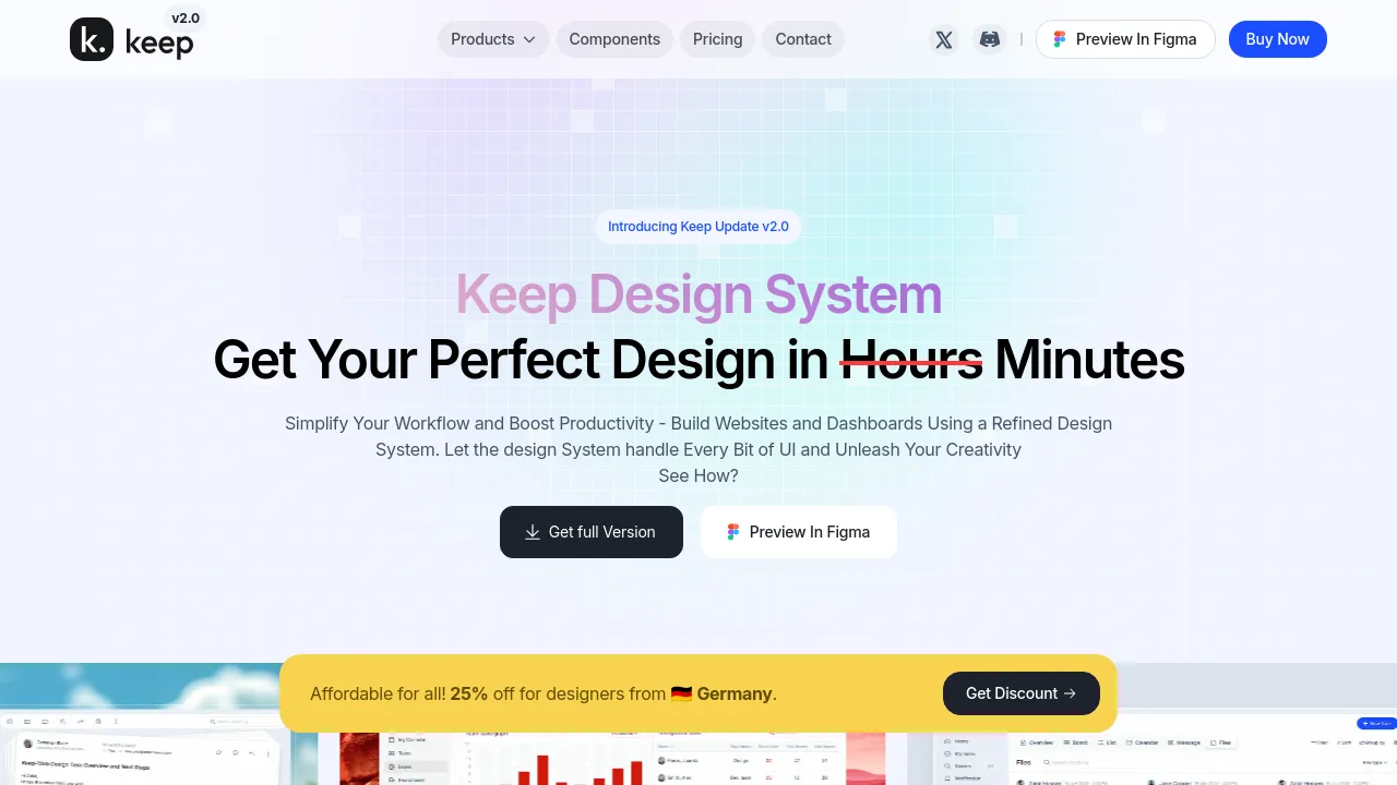
Build consistent UIs using over 40 open-source React components. Includes Figma variables, dark mode, and paid plans for commercial use.
Keep Design System is a design system built to help users create websites and dashboards. It provides a set of design elements and guidelines intended to maintain consistency across digital projects. The system supports React-based code and includes both design assets and React components, facilitating a handoff between designers and developers.
The system features over 40 open-source React UI components and interactive elements. It integrates with Figma through design tokens and Figma Variables, allowing users to apply design updates efficiently across projects. The system also includes a built-in dark mode option and offers lifetime updates for paid plans. The platform is currently in version 2.0 and plans for future releases include dynamic dashboards, customizable templates, and Web Blogs integration.
The system offers multiple pricing tiers: a Free version with basic components and a personal license, a Personal Popular plan for single users with commercial rights, and a Team plan for up to 10 users. All paid plans include premium support and lifetime updates.
Best for
- Developers needing a library of open-source React UI components.
- Designers who require a system for consistent UI and smooth design-to-development handoff.
- Small teams or freelancers needing a commercial license for their projects.
- Users who need design tokens and Figma variables for design coherence.
- Individuals looking for a free version with basic components and global styles.
Frequently asked questions
Does Keep Design System support React?
Yes, the system includes an open-source React library with over 40 UI components and interactive elements.
Is there a free version available?
Yes, there is a free version that includes basic components, global styles, and a personal license.
How does the system handle design updates?
It uses Design Tokens and Figma Variables, allowing users to apply design updates efficiently and accurately throughout their projects.
What is included in the Team plan?
The Team plan costs $249 and provides commercial license rights for up to 10 users, along with all components and lifetime updates.
Does the system offer dark mode?
Yes, the system comes with a built-in dark version that allows users to change the color scheme of an application.
Alternatives
- Adobe Express if you need an all-in-one AI content creation app for social posts and videos.
- Artboard Studio if you require a graphic and motion design tool with extensive content libraries.
- Beautiful.ai if you are primarily looking for an AI-powered tool to create professional-quality presentations.
- Artistly if you are a brand or social media influencer needing a platform to create visually stunning content.
- BannerBoo if you need a user-friendly platform to create ads for various social media platforms without coding.
- BrandBird if your primary need is transforming screenshots into stunning graphics for landing pages.
Similar to Keep Design System
New tools, once a week.
One weekly email with curated tools and founder insights. Unsubscribe anytime. Check our privacy policy.