Tools / shadcn/ui
About shadcn/ui
An open source collection of accessible React components styled with Tailwind CSS. Copy the code into your project, then customize and extend it freely.
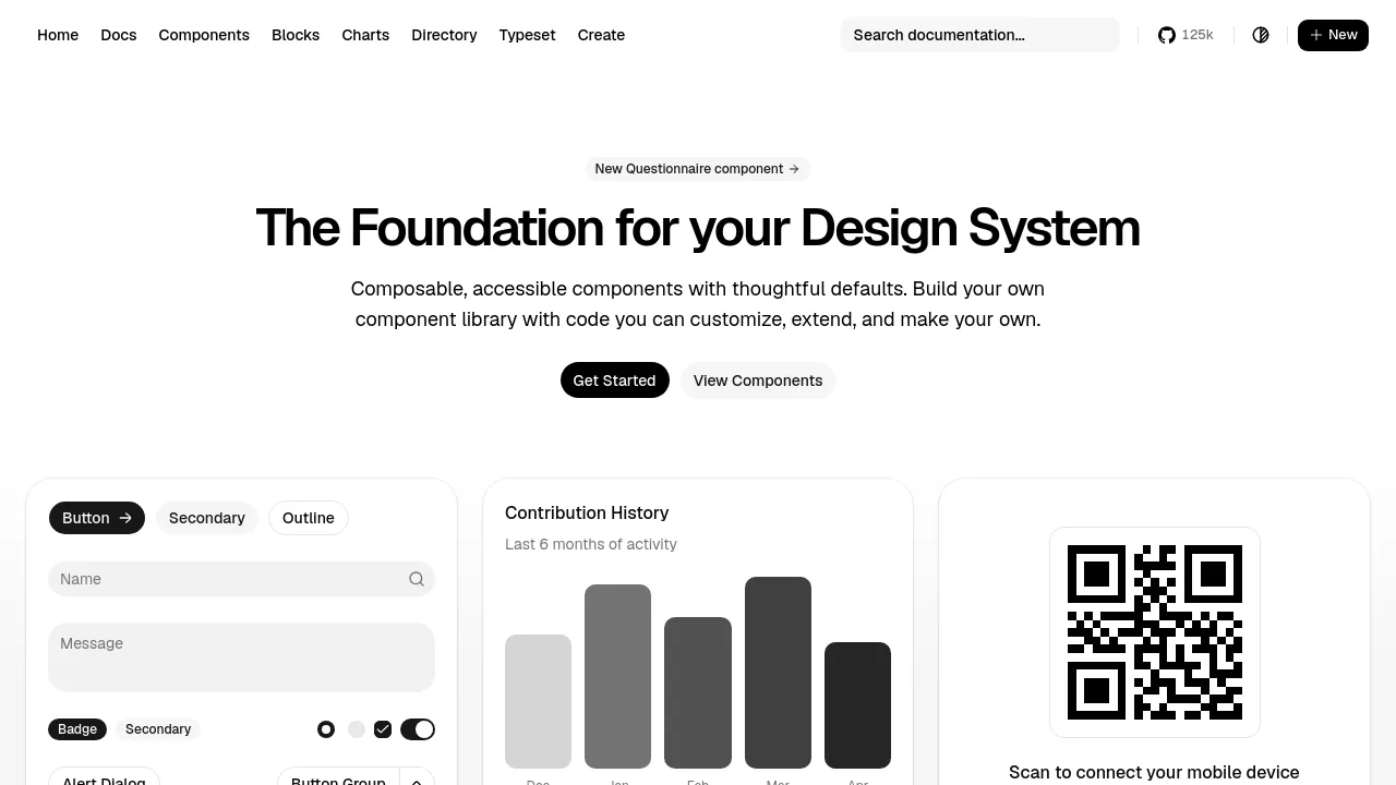
shadcn/ui is a collection of composable, accessible React components that bills itself as the foundation for your design system. The core idea is ownership: instead of installing a component package you have to work around, you add the actual source code into your repository, then customize, extend, and maintain it as your own. Components ship with thoughtful defaults — sensible styling and behavior out of the box that you are free to override.
Under the hood, components are pulled in through a CLI that writes the code directly into your codebase. Styling is done with Tailwind CSS, and interactive behavior sits on Radix UI primitives, which handle the accessibility work — keyboard navigation, focus management, ARIA attributes — that is easy to get wrong by hand. Theming runs through CSS variables, and the homepage shows the same dashboard rendered in both light and dark mode.
The catalog goes beyond basic primitives. Alongside buttons, dialogs, forms, tables, and dropdowns, the site demonstrates larger compositions: a personal-finance dashboard with savings-goal cards (a retirement fund shown at 65 percent achieved), royalty payout summaries, transaction and security alert lists, a scheduling view, and an analytics card tracking 418.2K visitors. A changelog tracks new additions — a Questionnaire component is the most recent entry at the time of writing. The project is free and open source.
One tradeoff to understand up front: because the code lives in your repo, updates are deliberate. You do not get fixes by bumping a version number; you re-run the CLI or merge changes by hand. Teams that want full control treat this as the point. Teams that want set-and-forget maintenance may not.
Best for
- React and Next.js developers who want to own their UI code outright
- Teams building a design system without starting from an empty folder
- Products that need accessible components without hand-wiring keyboard and focus behavior
- Projects already using Tailwind CSS
- SaaS dashboards, admin panels, and internal tools
- Developers tired of fighting a library's API to make one component look different
Frequently asked questions
Is shadcn/ui free?
Yes. The project is open source under the MIT license, and the components and documentation cost nothing to use, including in commercial products.
Is it a component library like MUI or Chakra?
Not in the traditional sense. There is no versioned npm dependency to install — a CLI copies component source into your project, and from that point the code is yours to edit.
Does it require Tailwind CSS?
The components are styled with Tailwind and themed through CSS variables, so Tailwind is part of the setup rather than an optional extra.
Which frameworks does it support?
It is built for React. The documentation centers on Next.js and includes setup guides for other React setups such as Vite.
How do component updates work?
Because the code lives in your repository, updates are not automatic. You re-run the CLI to pull in new versions of a component or edit the code yourself, and the site's changelog announces what has changed.
Can I use it in a commercial or client project?
Yes. The copied code becomes part of your codebase, and the MIT license permits commercial use.
Alternatives
shadcn/ui is code-first, so the closest matches in our directory are design-side tools rather than component collections:

Similar to shadcn/ui
New tools, once a week.
One weekly email with curated tools and founder insights. Unsubscribe anytime. Check our privacy policy.